Trigger JavaScript on Click of Button PCF Control
Overview
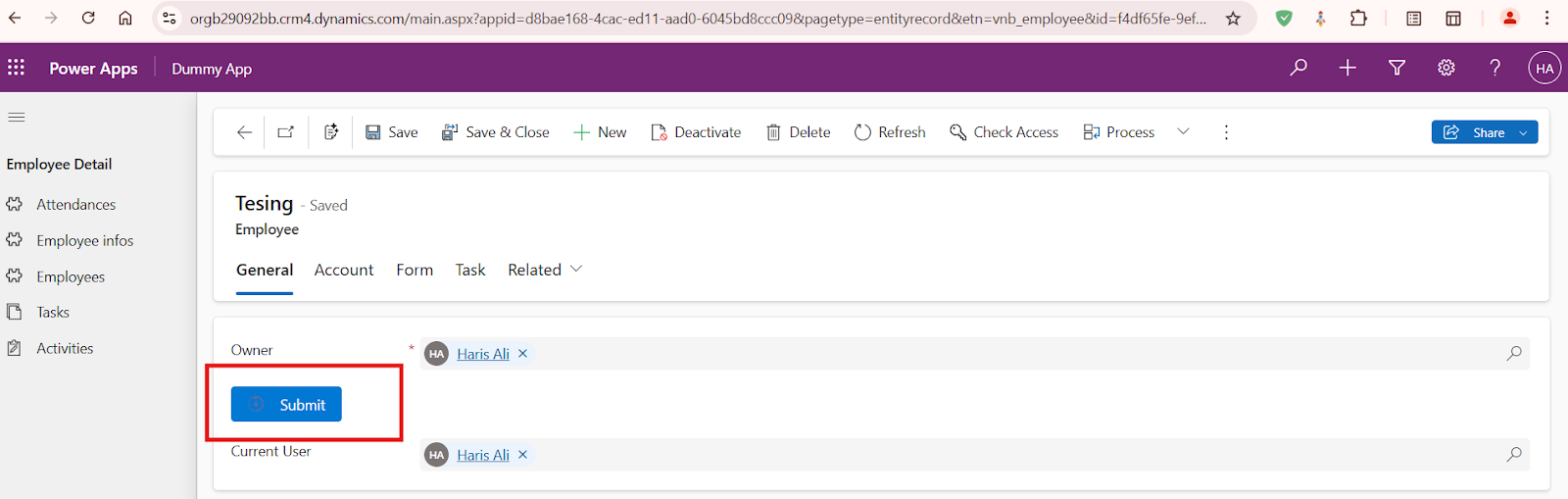
The TriggerJavascript control is a custom PCF (PowerApps Component Framework) control that renders a button with customizable label, icon, and on-click script execution. The control allows users to dynamically trigger JavaScript code upon clicking the button.
Dependencies
IInputs, IOutputsfrom./generated/ManifestTypes(Auto-generated types from PowerApps)CSS styling from
./CSS/TriggerJavascript.css
Class: TriggerJavascript
This class implements ComponentFramework.StandardControl<IInputs, IOutputs> and manages rendering a button inside a container, dynamically executing JavaScript code on button click.
Properties
Private Properties
_container: HTMLDivElement- A reference to the container element where the button will be rendered.
Methods
constructor()
Initializes a new instance of the TriggerJavascript control.
init(context: ComponentFramework.Context<IInputs>, notifyOutputChanged: () => void, state: ComponentFramework.Dictionary, container: HTMLDivElement): void
Parameters:
context: Contains the control's input and output properties.notifyOutputChanged: Callback function for notifying changes in outputs.state: Stores the initial state of the control.container: The HTML container element where the control is rendered.
Functionality:
Stores the container reference for later use.
updateView(context: ComponentFramework.Context<IInputs>): void
Parameters:
context: Contains the input properties that can be used for rendering updates.
Functionality:
Clears the container before rendering.
Retrieves the input parameters:
buttonLabel: The label text of the button.onClickScript: The JavaScript code to execute when the button is clicked.iconUrl: Optional URL of an icon to display on the button.
Dynamically creates a button element:
Sets the button label.
If an
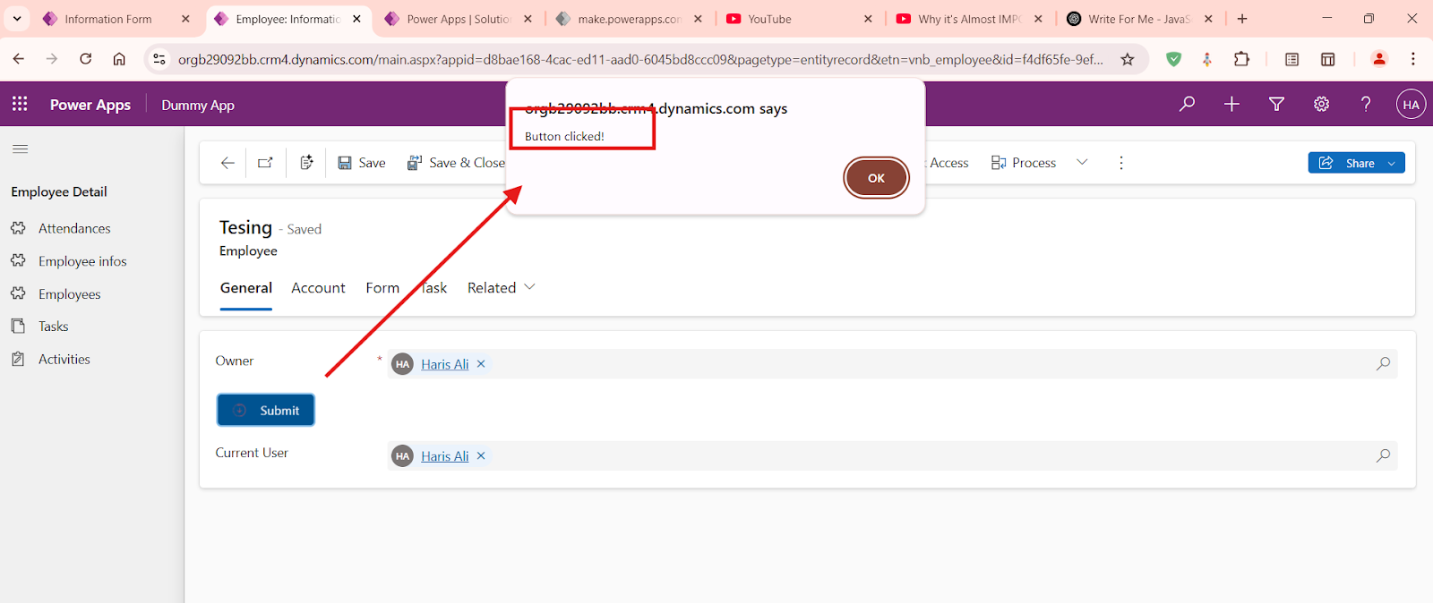
iconUrlis provided, it loads an image before the button text.Adds a click event listener to execute the provided JavaScript.
Appends the button to the container.
Error Handling:
If
iconUrlis invalid, logs an error and removes the broken icon.If
onClickScriptexecution fails, logs the error.
getOutputs(): IOutputs
Functionality:
Returns an empty object, as this control does not output values.
destroy(): void
Functionality:
Clears the container when the control is destroyed.
Example Usage
This control can be used in PowerApps to provide customizable button actions based on user-defined JavaScript.
Example configuration:
{
  "buttonLabel": "Submit",
  "onClickScript": "alert('Button clicked!');",
  "iconUrl": "https://example.com/icon.png"
}
Security Considerations
The use of
eval(onClickScript)poses security risks; ensure only trusted scripts are used.Validate and sanitize user input before execution.
Styling
Custom styles can be applied through
./CSS/TriggerJavascript.cssto modify button appearance.
Conclusion
The TriggerJavascript control provides a flexible way to trigger JavaScript execution from PowerApps, allowing dynamic behavior customization through user-defined parameters

Comments
Post a Comment